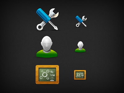
HiDPI Icons - Tip?
So I'm starting to build my icons in two sizes for the new HiDPI screens. I couldn't really find any tutorials out there or tips on how to manage your workflow of actually creating these graphics. It's a bit of a pain honestly to build every icon twice. Here's a few suggestions I have, but please feel free to add any ideas that you've found helpful.
1. Use vector shapes as much as possible.
2. Use layer styles as much as possible.
3. Not every aspect needs to be doubled. For instance a 1 pixel border does not need to be a two pixel border on the @2x version.
More by Steven Testone View profile
Like
