Website updates
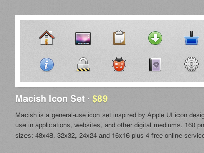
Some more previews of small changes to my website. Simply moving the title below the preview image really helps to block out each product.
Was trying a different darker style in the previous dribble, but just can't pull myself away from the white header/black text.
More by Eddie Wilson View profile
Like
