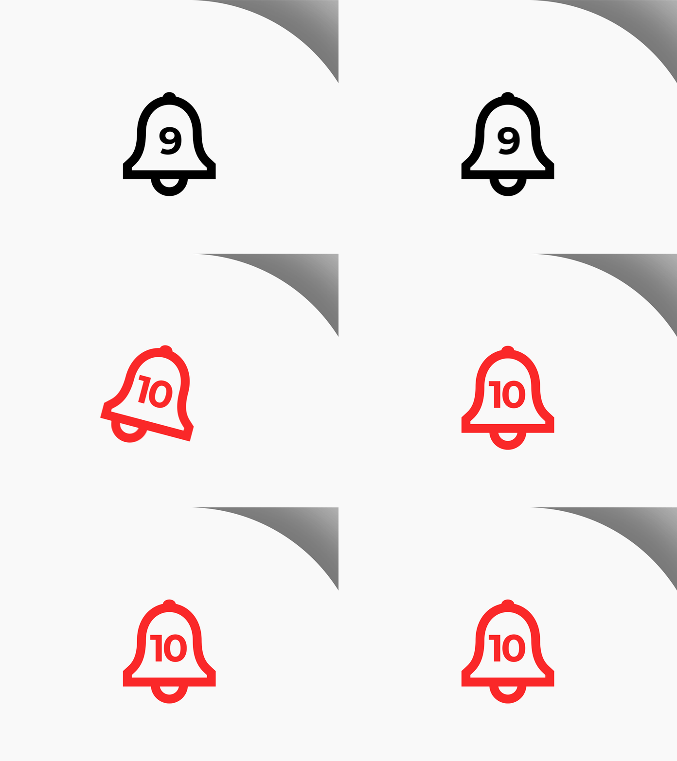
Daily UI #049 - Notification
Thoughts on Today’s Challenge
This is a 4x enlarged version of my concept for a notification icon. I wanted to show two separate states of the icon. The first state would be if the user has notifications that are viewed but unread, similar to Facebook. The second state, after the bell rings, is when the user has a new unviewed notification.
I also wanted to highlight the movement of the bell ringing, note the individual moving parts of the icon. This animation would occur every time the user gets a new notification. I imagine users with high activity rates would enjoy watching their bell constantly ringing.
-- -- --
The Challenge is to complete one unique User Interface design task every day, for 100 business days. You can read more about it here: https://www.dailyui.co/
Please press L if you like my shot! Also, follow me if you want to keep track of my progress on the Daily Challenges! See you at 100. 😋👍
