Daily UI #030 - Pricing
Day: 030 - Pricing
For this challenge, I wanted to take a shot a redesigning an online menu for a restaurant I frequent. You can take a look at the original here:
http://www.grandlakekitchen.com/lake-merritt-menus/#lunch-menu
One reason I used this site as a sample was that they had various menus that corresponded to the time of the day (Brunch, Lunch, Dinner, etc.). I thought it would be interesting to explore different ways of displaying this complex information in the simplest way possible. Also, I feel like their site (and most local restaurant sites in general) could use some UI design polish.
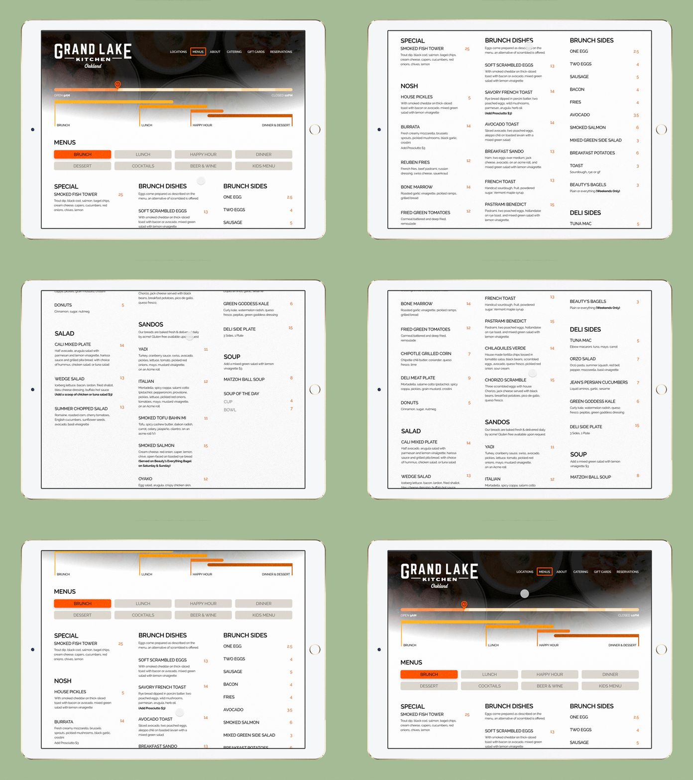
This GIF displays a mock-up of what the redesign could look like. I focused on 3 main aspects of this design: addressing hierarchy issues with typography, organizing the information more concisely, and implementing an experimental way to display which menus are relevant according to the time.
To expand more on the last point, I tried to achieve this goal by creating a “live” timer that would correspond to the actual time of the day. The time would be indicated in a progress bar starting when the restaurant opens (9 am) to when it closes (10 pm). Below the progress bar are visual guides to indicate which menus are available at the time the customer is looking at the menu online
-- -- --
Follow me if you want to keep track of my progress on the Daily Challenge! Your likes and views give me courage. 😋👍
The challenge is to complete one unique User Interface design task every day, for 100 business days (the weekend doesn’t count!). You can read more about it here.
