Xbox Notifications Metro Redesign
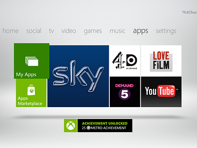
So I was bored the other day and thought I give the xbox notifications a long overdue metro treatment. :D
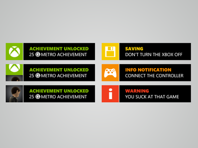
There are 4 different categories that a notification can have. All the new notifications are color-coded. So you have a color icon and the font in the appropriate color.
Green: This is the regular achievement notification. You can put the according achievement picture instead of the green xbox logo in the box. I also got rid of the circle and the visual aid to see which player just got the achievement. In the new version you have a similar effect to the windows phone where the tile/green xbox logo kind of "jumps" up and the avatar picture comes from the bottom up and pushes the tile up (watch a video of a windows phone where the contact tiles go crazy on the start screen). That would be the same (and known) behavior and much easier to see which player just got the achievement.
Yellow: The yellow notifications are for saving (just like the yellow light on the xbox itself when it's saving). It also has an save icon so you can just glance and see what the notification is all about.
Orange: The orange notifications are for all kinds of information. You could display a bunch of stuff there like "connect the controller". These notifications would also have different icons in them.
Red: Red notifications are there for the important stuff. So if something went really wrong that notification would be perfect to display the message since it comes in red.


