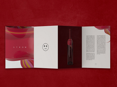
Strow - Brochure Design
Strow - Part four.
A large percentage of wine brands consists of plain white labels. Strow is our attempt at fighting the monotonous tone of the wine shelf. In this branding, we approached the label as more of a 3d element than a simple flat print. We utilised the neck of the bottle to give the ‘swirl’ a home as it entwines itself around the upper third of the product. This swirl was then used as the hero object running throughout all of the brand's promotional items. This branding lends itself to be very versatile as once the flavours of the wine are changed, so can the colours of the bottle.
More by The Coup Designs View profile
Like
