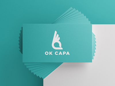
OK CAPA | Logo Design
OK CAPA.
For this project I decided that a bright vivid colour was the best option. It makes the logo stand out even more.
Do you prefer coloured or B/W logos? Comment down below ⬇️.
Have a nice week ✌
More by Romeu Pinho View profile
Like
