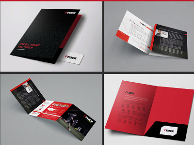
Corporate Folder and Tri-Fold Design
Working with a brand whose primary colors are red and black can be VERY dangerous. Readability, particularly for print materials is something to be ware of. In this cause, although I may have sweat all the way to the print shop, the find designs turned out gorgeous, bold, and original.
Thank you for viewing, please like and follow me and then use the links for more information about my work:
More by Bridgette at Bryant Design View profile
Like
