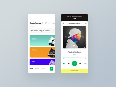
Spotify Redesign Concept
Hello Friends,
This time it's a UI Concept for Spotify. Some of my design decisions on the first screen are trying to reduce the decision fatigue when exploring new music by organizing the information on tabs and the rest of the UI it's just me having fun! But I do think that would be nice to have the lyrics with just a swipe up.
What do you think of it?
Tons of hugs, you're special!
Cheers!
✋ Press "L" to appreciate it!.
More by Jesus Sandrea View profile
Like
