Challenge prize table
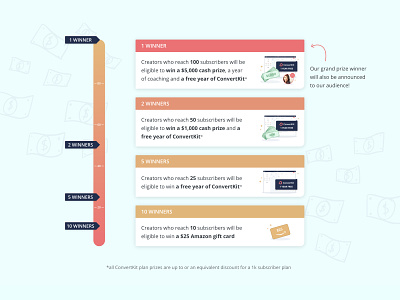
Here's where I ended up for the table of prizes for our Landing Page Challenge.
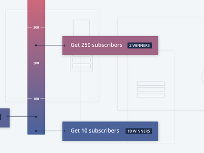
The lines connecting to the prize gauge got nixed to simplify the design in order to meet the development deadline, and the gradient changed to warmer tones as the previous was feeling a little too chill for the excitement we're trying to generate with this contest.
I also decided not to make the table interactive, but to instead just reveal all the information of what's in the prizes on the page without any extra clicks, because why on earth hide all that great stuff!?
Little illustrations for each prize help show that in general you can win more stuff, the more subscribers you gain.
If you want to check out the challenge or see this prize gauge in situ, here's the sign up page! https://convertkit.com/landing-pages

