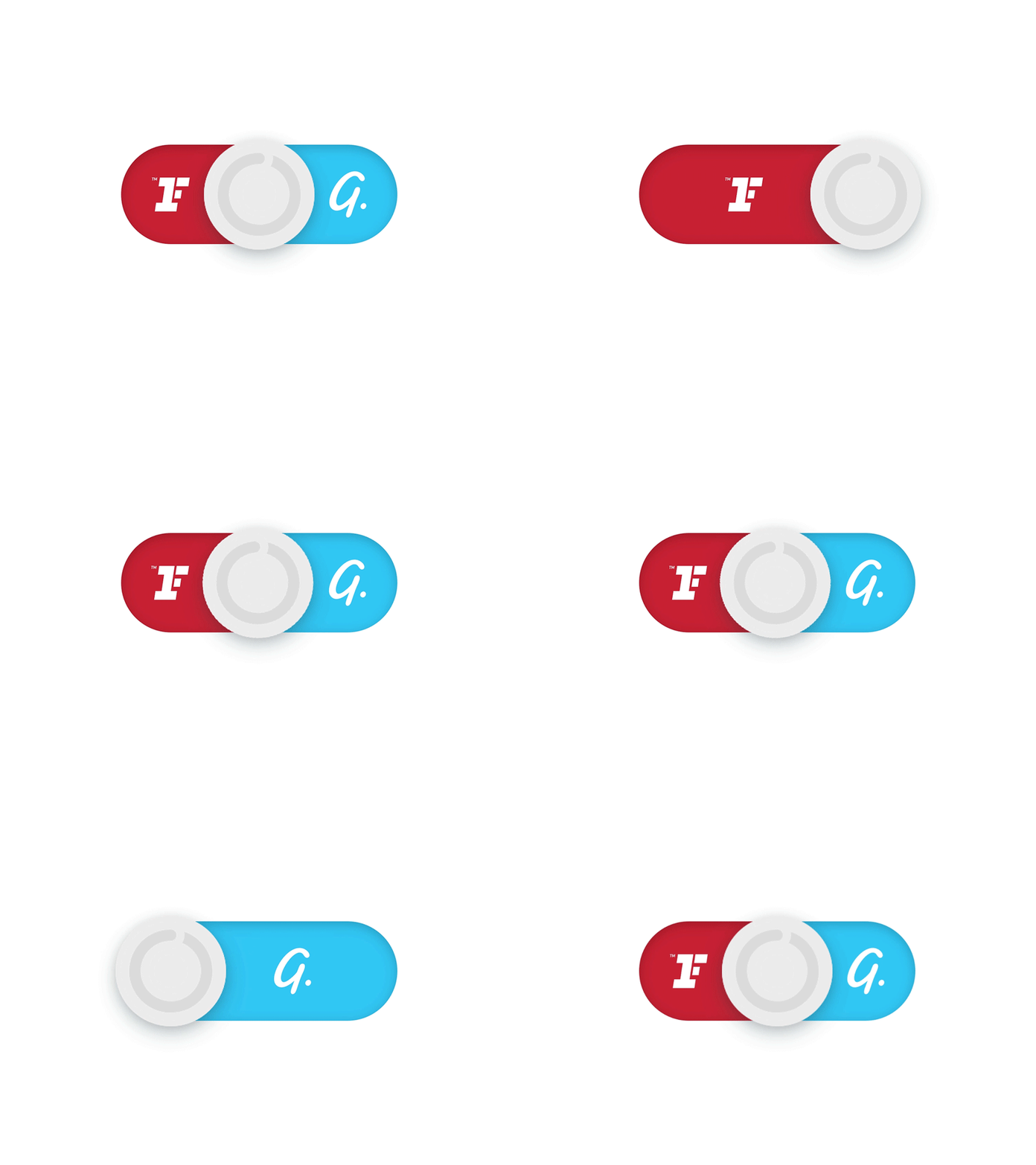
Unused brand toggle concept
This was initially a concept for toggling between showing both gym chains, or filtering to either one.
Even before I animated it, it was clear that it was a confusing interaction and not a good idea, but I continued to explore it for a bit of fun, and as a potential concept for an animation on the CTA pop-up prompting users to apply a filter.
It was double confusing used that way, because it did look like the user could interact with it, so it was scrapped before even getting to usability testing.
Seemed like something silly and fun to put on Dribbble though…
More by Jai Mitchell View profile
Like
