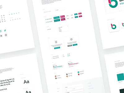
Educational Platform Style Guide
Overview of a branding and design system document I created earlier this year for an educational platform in London. Created one Sketch template to rule them all, with everything synced up to this doc ready for developer handoff, allowing instant updates across all the designs company-wide.
Find it far easier to create harmonious designs and focus on the core product this way, with an eagle view of the whole product and its marketing.
Some of the sections include: branding and identity, tone of voice, marketing campaigns, presentation documents, content optimisation, illustrations, UI kit, colour palette, iconography, typography and social media presence.
Excited to share more soon.
More by Carl Spencer View profile
Like

