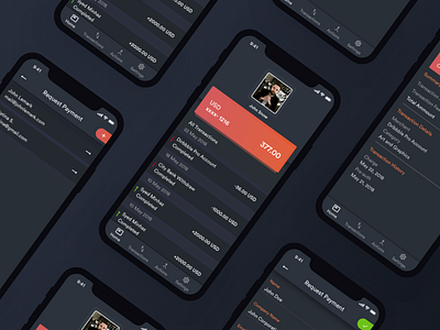
Payoneer Redesign (Dark UI)
Hi there
We all know payoneer recently updated their mobile app UX and UI. As a regular user it didn't looked awesome neither the UX felt totally flawless. So we started redesigning the whole app and also as a bonus we added some extra features in the app.
This will be a series of payoneer screens and Case study continuously. stay tuned to see the UX transitions and new UX and different variations of UI.
After completing Full case study it will be published on Behance
More by Syed Miraj View profile
Like

