A Dos Colores
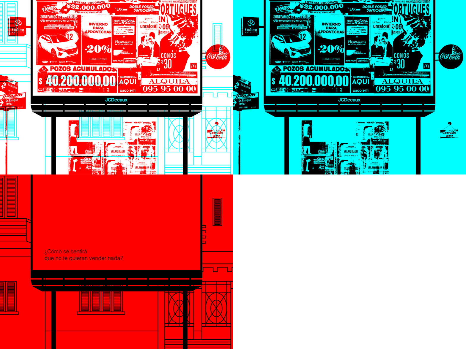
This is a cropped view of a poster I did for university. It was through a dual meaning technique:
"The blue and red will be used to create an image with a double message overlapping both colours. We have created a system of filters (same colors) to cancel the portion of the image corresponding to the color of the filter used and showing the message of the other color."
You can take a look at the original project here: http://condoscolores.tumblr.com/
For an extended explanation of my version and see it in large go here: https://www.behance.net/gallery/66323253/Contaminacion-visual-a-dos-colores
More by Facundo Matiaude View profile
Like
