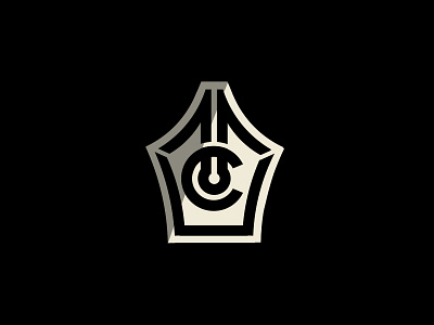
New Personal Brand
I had been thinking of updating my personal logo for a while now, so I retooled and now present to you my new brand for MCD!! My old logo was just that a logo, and had more of a sporty aesthetic to it, https://imgur.com/tP7QWxK but I hope to have now really created a brand for myself that well represents my work. I'm also on the cusp of a hopefully pretty cool new work-intensive project based on the history of design, so I figured it would be as good of a time as any for an update that I feel better reflects my slightly evolved style.
The logo itself is simple yet still kind of complicated, a old school pen nib with my initials incorporated as seamlessly as possible without being forced. I tried to make it feel very retro too, landing anywhere between the 20's & 50's imo. I'm very happy with the finished product, but as always with logos with hidden elements, it's all about whether other people can read it well. Let me know what you guys think! Upgrade? Downgrade? Somewhere in between? Love to hear any and all feedback! Thanks!
And stay tuned for a big new project I'm very excited for in the coming weeks!
