Perpetual (Mini Player) — Round 2
ABT: Always be Tweaking
I've gotten around to refactoring some of the window's layout in Xcode and some compelling force drove me back into Photoshop. That said, this update adds a bit more polish on top of the shot this rebounds.
What changed?
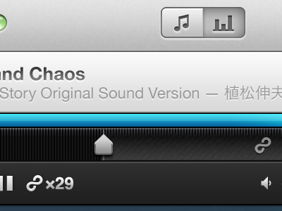
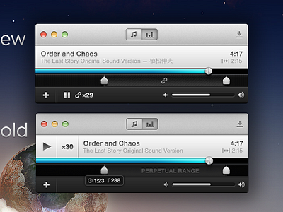
1) The play/pause button is now in the footer as is the loop counter. As such, the title now takes the full width of its bar, which just feels better.
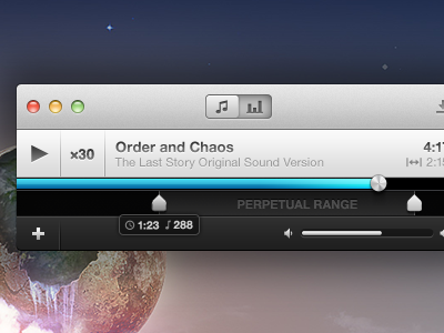
2) I've removed "Perpetual Range" and replaced it with a simple infinity symbol. This'll make a lot more sense once the application icon is released. As you can see, the symbol is also used next to the counter.
3) Tick marks! Their opacity will change (read: brighten) when you grab a range marker.
And, that's it. :) Check out the attachment to compare the full sizes of each version. Remember, if you'd like to follow our progress, visit us here: https://github.com/revyver/perpetual
(One more thing... designing @2x is pretty awesome, even if the application won't be 2x... yet.)


