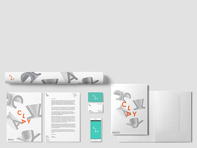
Clay – Branding Concept #6
And it seems like this is where we've settled... We think this colour scheme best interprets us as a design studio.
The grey, clay-like abstractions of the letters give more of a "digital" look, especially when juxtaposed against a bright teal and orange which creates a clear visual contrast between the different elements and is a bit more exciting than just grey throughout.
Still some experimenting left to do with the shapes themselves and how they might best work, or if there are other ways of interpreting this idea of "digital clay", but we think this is pretty close.
As always, open to thoughts and feedback!
More by Joe Million View profile
Like

