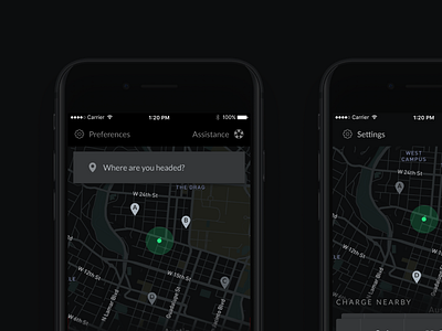
Consumer charging - dark
The second installment of a consumer charging recap, find the first here.
More shots of our consumer charging app. To solve goal #1 (ensuring drivers are comfortable taking their electric vehicle rather than internal combustion), I designed a destination-centric discovery path.
Users are automatically shown what's nearby their current position, but when you're heading to the store, or out to a theatre, it's incredibly useful to know if you can charge at your destination, or at least within walking distance.
For this use case, we used Google's location API, as well as the directions API to show and calculate distances, to quickly determine feasibility as a charging location. The card content actually changes depending on whether the origin of the route was through destination charging, or "charge nearby," because the most important information changes.
Contextually changing interfaces proved super useful with our chat product with the scheduler, and, with a good component library, it's not much more difficult to design and implement.
I'm looking for a job! Are you hiring product designers? Check out more of my work, and case studies here.


