Skillbuilder
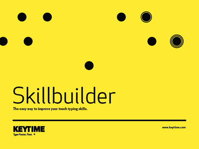
Developing a new brand for KEYTIME® (a business based on a unique method to teach typing). The dots represent keystrokes that spell the name 'Skillbuilder'.
The dots create a visual language for the brand that is playful but represent the way our minds memorize key placement when learning to type.
The concentric circles represent multiple hits. The font is Apex New. This is the initial design for the cover for their primary teaching booklet.
More by Travis Fleck View profile
Like
