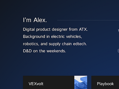
Take 2
I posted a couple weeks ago about a new portfolio site I worked on (check it out here). With that revision, I was designing to be "light (in both weight & cognitive load), professional, and informative," which lead to an aggressively simple page.
I posted on Designer News, and gathered feedback from my network, and went back to the drawing board. The previous build lacked:
1. Information. I believed that linking to outside services which I kept updated (like Dribbble, and Instagram), would serve to represent my work, but instead it represented a barrier to my work, because it wasn't clearly accessible. Simon Evans on Designer News put it well. "Don't make me hunt for your [work]"
2. Personality. A black and white, lots-of-whitespace layout was unique, but it lacked personality. This iteration brings in images, color where there wasn't, and lets me draw people in visually with the unique blend of skills + projects I have in my CV.
You can see the live site here, and send feedback to me here. Thanks for reading!


