Daily UI #029
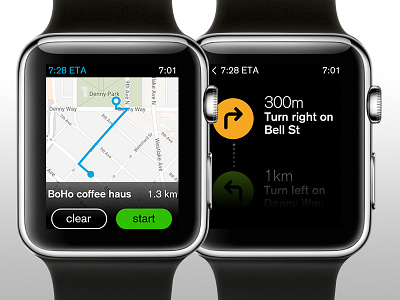
I tried my hand at designing an UI map for apple watch. The right and left turn arrows are different colours to help better separate direction. As you scroll down, only one direction at a time will show, the rest hidden under a gradient to focus the user while driving.
More by Shannon Pang View profile
Like
