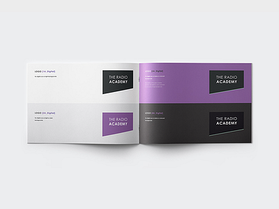
Radio Academy – Brand Guidelines #1
Another project from 2015.
These were put together under a serious amount of pressure, and as the only designer on the team, I had to come up with the concept, refine it and carry it all through to completion. Including creating a set of guidelines to help TRA to use the new branding effectively. There was no help.
I shot myself in the foot with the logo by adding in the green line / highlight. The client really liked it – whereas I'd changed my mind and was regretting showing them the concept. Hence why I've given them both version to use, one with, one without.
In some ways, it almost looks like a "razor", which I suppose works with the "edgy, modern" look they wanted to go for.
Unfortunately, as the project was being micro-managed by someone who lacked experience, the branding was never developed to it's full potential. A shame, as it's now being used nation-wide.

