Progressive Architecture – Web Concepts #7
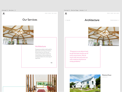
Further work on Progressive's website concepts. Aiming to keep things nice, light and simple, bringing in colour where possible without making it overwhelming.
The page on the left will be an overview of each service, the page on the right will be the selected service page, which will present some relevant projects and detail as to what the service includes.
There will be a nice an easy navigation on the selected service page at both the top and bottom to flick between services.
Also intending to create a visual link between uppercase text as hyperlinks / interactive elements.
More by Joe Million View profile
Like
