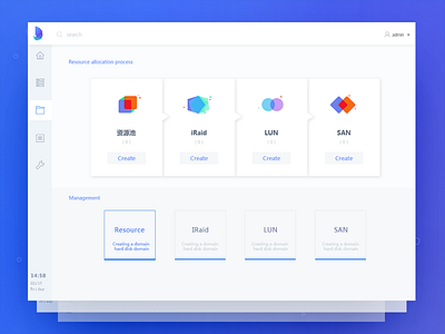
Distributed management tools
【设计优化】
@Qin Zhang very thx for the logo!
his url :https://dribbble.com/shots/3786161-New-Logo
附件有中文版
改版方向: 突出内容主题,通过留白来取代颜色和线之间划分的层级关系。可以使页面变得更加清晰可见。
the transition by google:
The annex has a Chinese version
Direction: highlight the content of the theme, through the white space to replace the color and line division between the hierarchical relationship. You can make the page more visible.
More by nier View profile
Like


