Aerie Homes — 2 𝑜𝑓 2
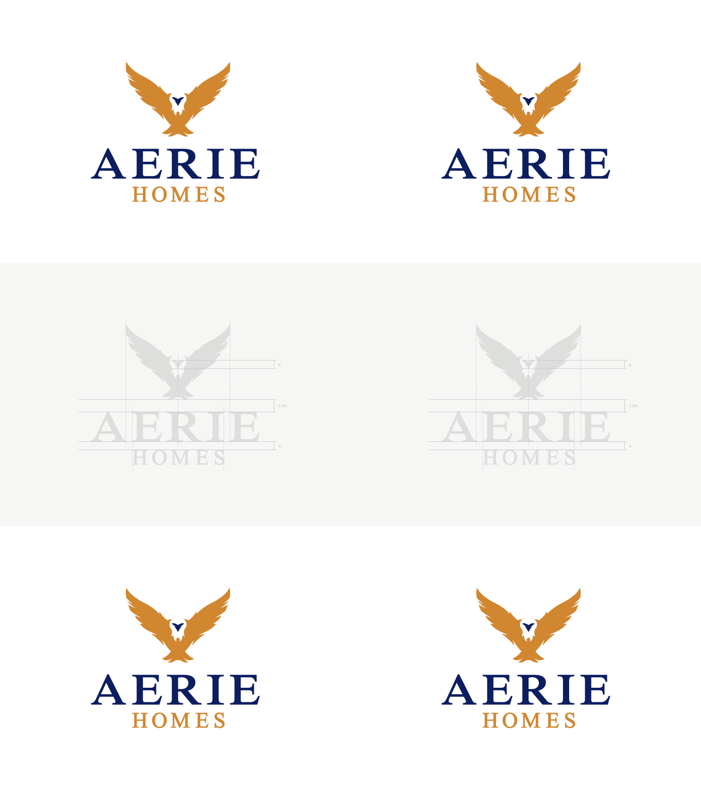
In order to get the typeface "Iskoola Pota" to balance just right with the mark I had to really spend a good amount of time searching for the right edges to align. I'm happy with the final outcome even thought the "A" creates a bit more space next to the "E".
More by Matt Henriksen-Brown View profile
Like

