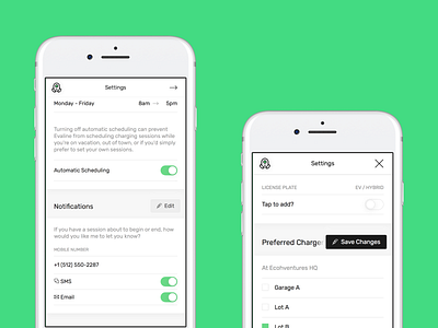
Settings screen
+ More prominent edit buttons that better match the style of other buttons throughout the app, without distracting from settings content. Additionally, edit buttons now are more usable on smaller screen sizes, whereas previously they would line-break the section titles.
+ Added a "vehicles" section, so users can add more information about their vehicles.
+ Moved mobile phone down to notifications settings, rather than next to vehicle data, for better IA.
We've had low engagement with the settings screen in general, but I've had several conversations with users expressing needs directly solved by sections in the settings screen. I'm hoping that these new updates will make it more intuitive for users to personalize their experience with Evaline. ✌️


