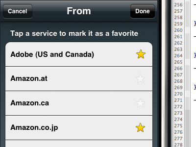
Delivery Status: Favorites
Trying to work out the UX for favorites.
Originally the plan was to have these stars always visible. You could tap the star to mark or unmark it as a favorite. The list would have two sections: "Favorites" at the top, "All Services" below that. Marking a delivery as a favorite would add it to the list at the top. Pretty simple.
Once I started coding and testing this, I ran into some problems. The stars add a lot of visual clutter for something that won't be used often, and take up space needed for some longer names. Adjusting the Favorites list at the top when a star is tapped results in some awkward animations. The star also obscures the checkmark for the currently selected service, though that could be worked around.
Currently I'm trying out a revised system that adds an Edit button in the top-right corner. Tapping the Edit button temporarily hides the Favorites list and shows the star icons. Mark some as favorites, tap Done, and it returns to the normal view with two sections. The main quirk with this approach is that the table moves around when you tap Edit or Done, which is disorienting if you want to favorite a service you're already looking at. I'm hoping I can fix that with some clever coding.
