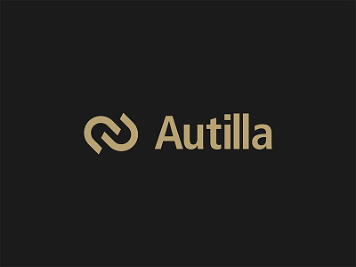
Autilla Logo
Branding for London based financial technology company which provides solutions and services to the precious metals community. The icon above plays on the ‘Au’ from the brand name which also is the periodic table symbol for gold. I've created a simple modern form, reflecting two interlinking shapes which create the A U. The interlinking symbolises the integration of different technologies that Autilla can provide for their clients; connectivity between users, exchanges and third parties.
More by Jamie Fox View profile
Like

