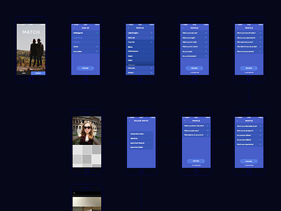
Sign Up User Journey WIP
See attached for high res version.
Looking into how we can minimise the 27 page user journey to sign up to the Match dating app.
Each question on the current app takes up a whole page which after a while, can be quite time consuming. I've recreated an experience where each page has its own area - (location, relationships, personal info etc) so it's easier to manage.
Lots more to come!
More by Adam Sidaway View profile
Like

