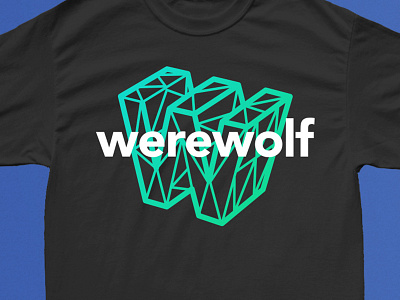
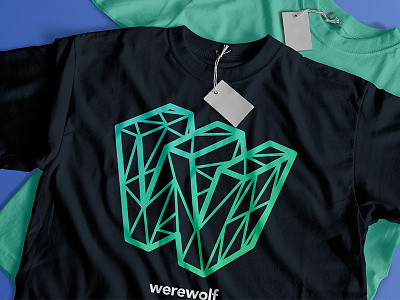
Werewolf Alt Shirt Design
I was playing around with this idea of overlaying type over the icon, as opposed to simply putting logo underneath.
Going to sit on it for awhile and see if I start leaning towards this one more. Legibility is obviously an issue, but it feels more dynamic and eye-catching.
More by Josh Martin View profile
Like

