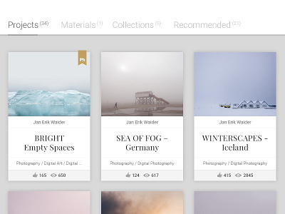
Behance Cover Image – Redesign Concept
I love Behance but I'm not a big fan of the Cover image design. I would give them a little bit more space to breathe (especially when browsing/exploring) and put a clear emphasis on the title of the project which is currently almost on the same hierarchal level as the author name and the tags.
Also, I wouldn’t hide the ‘Feature Flag’ in the bottom right corner of the project box (see here for an example), but to put the colored version the flag on top of the Cover image like the first project in my concept.
I hope you like my idea and I would appreciate your thoughts and comments on this. All photos in the screenshot were taken by me and based on my Behance profile.
Fonts used: Roboto Light / Regular and Playfair Display Regular
Thanks!
-Jan
–––
see the @2x version for actual pixels.
