Heron and Fish Logo

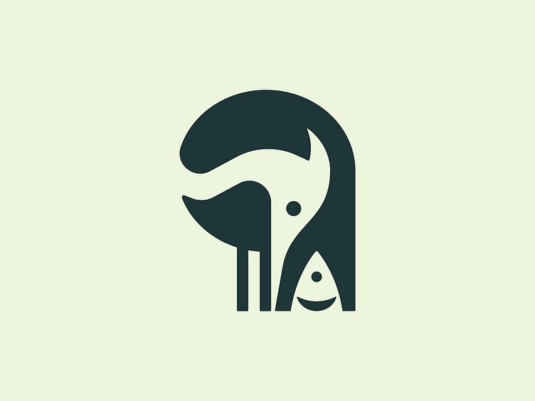
I attempted to refine the proportions of a recent heron logo.
The body was reshaped, making it less round and slightly flattened, which helped lengthen the legs. In the updated version, the fish was swapped for a frog to add variety.
Which version do you think works better?