Threedot - Home Page
Hello everyone! 👋
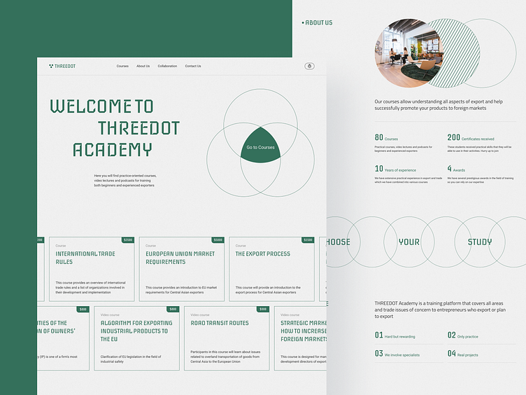
We continue to share our work with you. Threedot offers courses that will allow you to understand all aspects of exporting and help you successfully promote your products to foreign markets.
Homepage it’s often the first impression users get of a product or brand. A good homepage should communicate the brand's value proposition clearly, guide users intuitively, and load quickly to capture interest immediately. It should balance aesthetics and functionality, prioritize essential information, and feature clear calls to action that guide users deeper into the site or app, ultimately setting the tone for the user experience.
That’s what we tried to achieve with the home page for Threedot. The main goal was to redesign the existing pages. It was necessary to make the site modern, serious and progressive.
Full Preview🔥
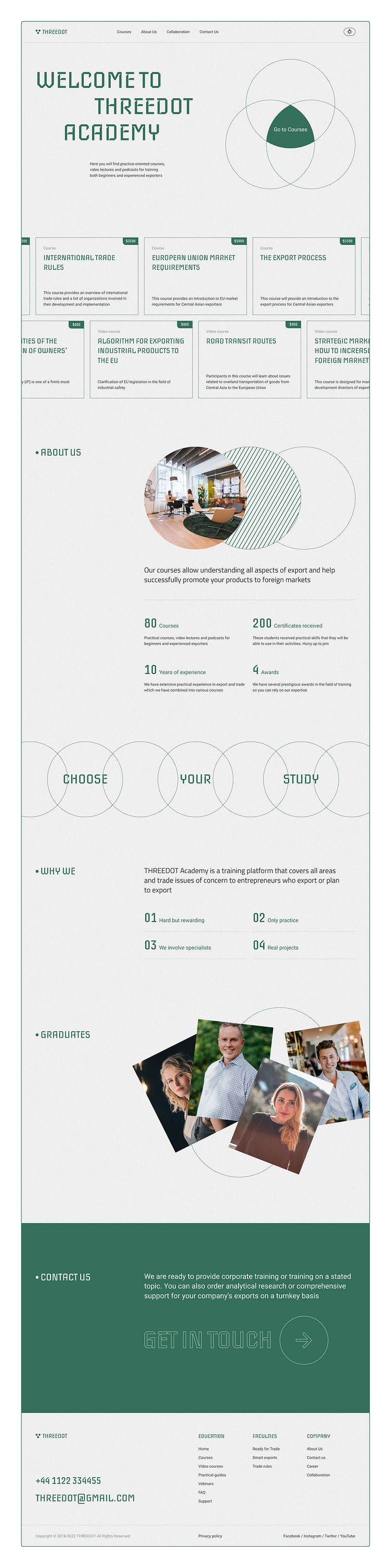
We carefully select the color palette and fonts that align with the project's personality and goals. This thoughtful combination of typography and colors creates a cohesive visual appeal that enhances user engagement and sets the right tone for the experience.
The headline font, Iceberg, brings a distinct character and elegance, while Roboto provides readability and versatility for body text. Paired with a balanced color scheme of neutral, green, and dark tones, this style creates an inviting and professional atmosphere that supports the content and encourages users to explore further.

Thanks for your time❤️ Stay connected to see more woks⚡
We would love to hear about your idea.
Book a quick call ☎️ | Visit Our Website 🌎
Follow us for more inspiration: