Logo Refinement for Pico Electronics
A New Look that Feels Modern and Strong
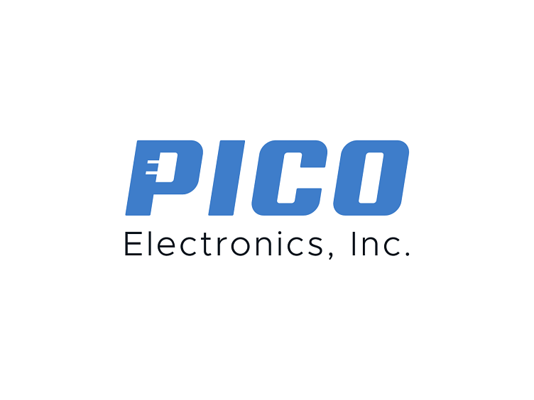
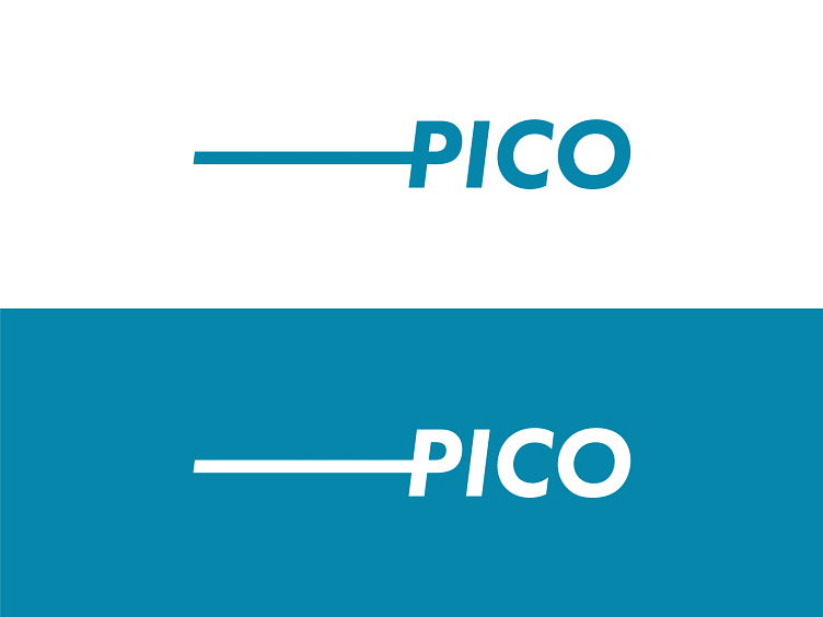
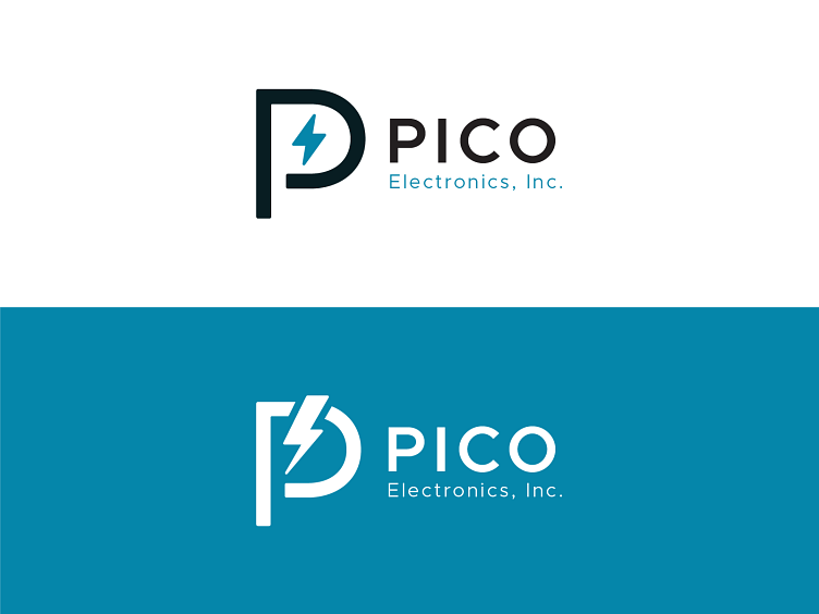
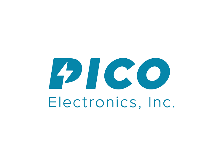
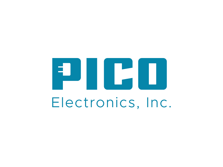
Pico Electronics has been in business since 1967, which is pretty impressive, and the logo hasn't changed much over the last 50+ years. When Pico approached Orbit about their website needs, Pico expressed interest in also refining their logo to something that felt more modern. They didn't really provide too many parameters, but I had a feeling that they wanted to retain a very simple, sophisticated look. The logo above is what the client ultimately approved, this is what the logo looks like on light-colored backgrounds.
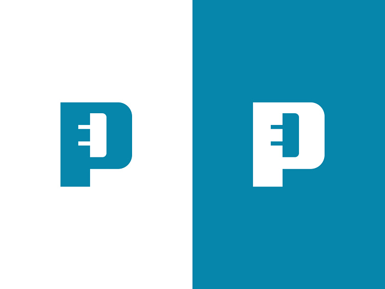
Initially, we presented 5 or 6 different concepts, all of which you can see below as you scroll down the page. This particular concept, though (above), stood out to the client because they really appreciated how the tiny electrical component exists within the bowl of the letter "P". They felt that that really spoke to their industry, without being overly cute and clever... clean, straight to the point. That's precisely how I'd describe the client.
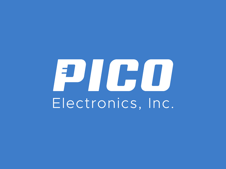
Below, is what the approved logo looks like on a dark-colored background.
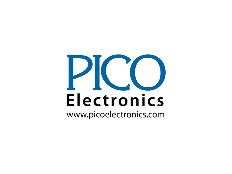
The Original Logo (below)
This logo had persevered years of use, and by all accounts, is a decent-looking logo. We all appreciated the brand equity that this particular logo has, there's a certain familiarity that exists amongst Pico's clients. One could argue that "if it ain't broke, don't fix it."
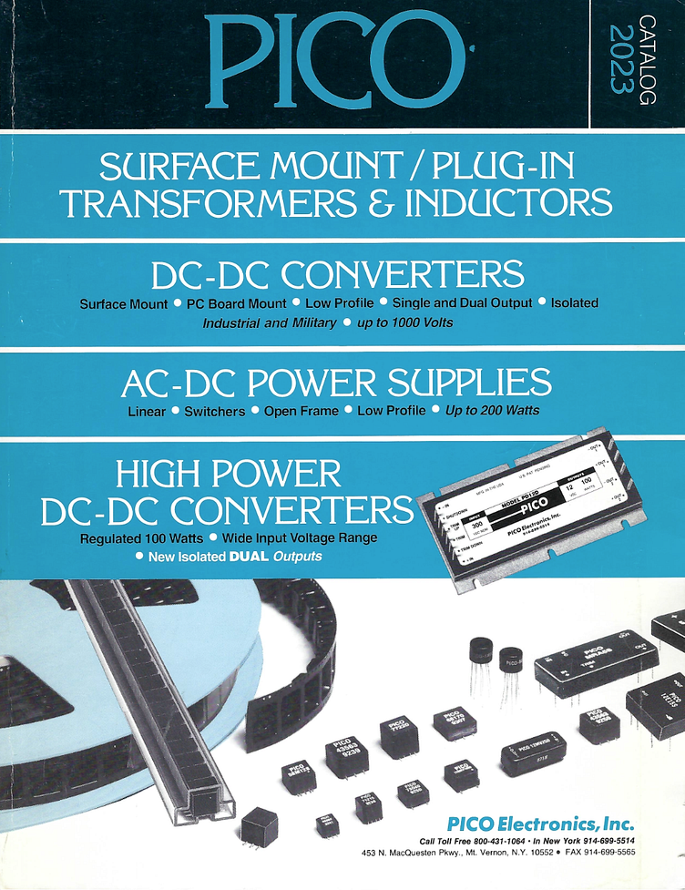
Existing Catalog Cover (below)
The client provided some existing collateral to serve as inspiration. There's a couple things to respond to in this catalog cover below... obviously the large PICO at the top of the page, but also, there's a small PICO logotype on some of those mechanical parts, which was of inspiration for one of our early concepts. Regarding color, I was inspired by this kinda-retro-feeling blue, and tried to tie-in something similar in my first round of designs.
Concept A (below)
In our early conversations with the client, I heard that they had a fondness for the simple PICO logotype that exists on the various parts in the catalog cover above. So, for one concept, I thought it might be wise to share that with them as an option. I mean, technically, I'm simply showing them something that they already have and use, but maybe we could position this concept as THE ONE AND ONLY variation that they use moving forward, and do away with the serif variation from further above.
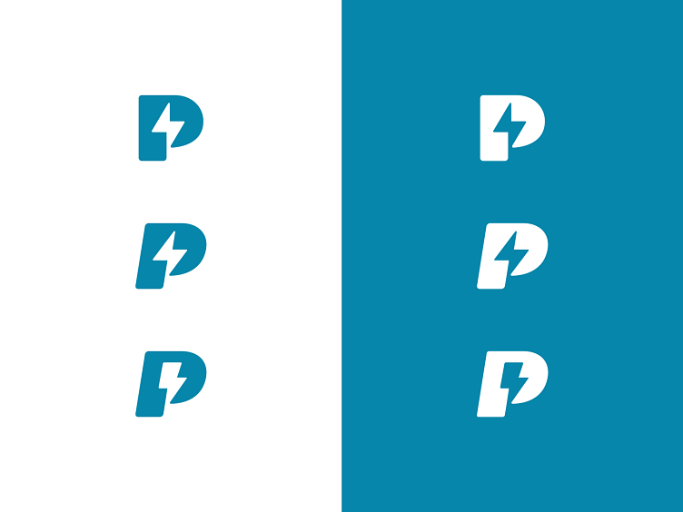
Concept B (below)
For this concept, I wanted to try to incorporate another design element, and began experimenting with different kinds of lightning bolts or electrical charges... and that was part of my inner struggle, the desire to portray this element as more of an electrical charge, and less as a weather element. The "P" shape is simple, clean, slightly stylized. Below, I'm looking at different color relationships.
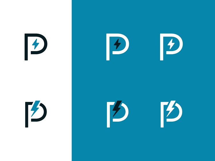
Below, I'm just presenting a couple different looks for how the "full" lockup could look for this particular concept... I found value in showing the light-background option, as well as the dark-background option.
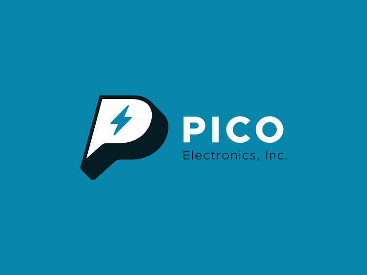
Concept C (below)
For this concept, I wanted to try to make this mark a little more sporty, almost something like what an athletic team might use... There's a certain punchiness to this variation that I was responding to. I'm not suggesting that a "sports" logo would have been ideal for this client, per say, but in my explorations, I find value in trying a variety of different things to see what the client responds to. Who knows, they may have really loved the strength of the black "P" shape. Angling the mark also adds some movement, making the mark feel more dynamic, which also results in a more "sporty" feel.
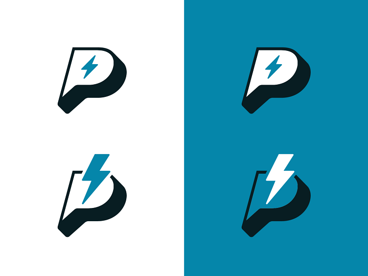
To ground the "sporty" nature of the mark, I chose to pair it with a very simple sans serif logotype.
Concept D (below)
For this concept, again, I'm exploring the use of that electrical charge element, but trying to do so by reversing it out of the "P" letterform, trying to find a unique relationship that makes the composition look clean, simple, deliberate. Honestly, I was really digging these options below.
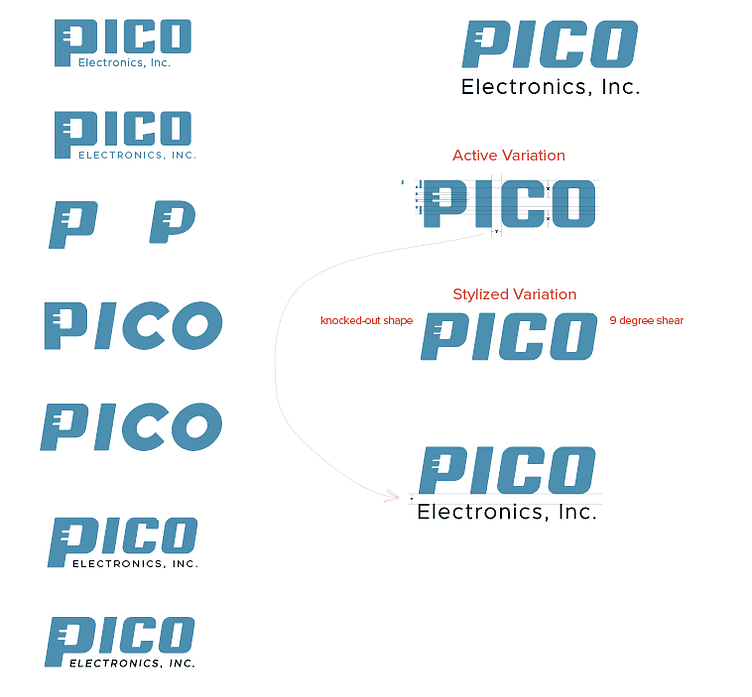
Below, I chose one of the mark options from above, and incorporated it into a full logo lockup... by adding a 9% shear to the "PICO" word, it provided a certain feel that felt more active, but not overly active... I then paired that with a very clean "Electronics, Inc." in a much lighter font weight. Everyone on our Orbit team felt really confident about this concept.
Last Concept, Concept E (below)
This was the last concept we shared, this idea was an extension of the use of negative shapes from Concept D, but rather than use an electrical charge, I tried using simplified illustration of one of the Pico parts.
This particular concept really resonated with the client, they thought that this far more clever than the other concepts, and to my understanding, the electrical charge was a little trite to the client.
Below, I created a custom PICO logotype to accompany the mark. The client, however, was not too fond of this logotype. They said it felt too rigid, too cold, not approachable. They said that they really liked the logotype from Concept D, but felt that perhaps that one was maybe a little too bubbly.
Designing On the Fly
As we began getting feedback about Concept E's logotype font, I read the room (on the Zoom call) and saw an opportunity to begin making adjustments based on what they were telling. us. Below, is a handful of unpolished rough ideas that ultimately led to the finished approved logo at the very VERY top of this page. My goal for the logotype font was to strike a balance between Concept D's logotype and Concept E's original logotype. Over the span of 10-15 minutes in the presentation, everyone on the client side was ecstatic about what we had all created. To me, I think it was wise to really give the client some space to voice their ideas and feedback... I think that allowing them to feel like they had a hand in the process really helped close this concept.
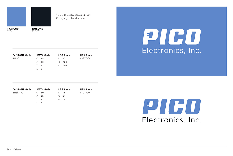
Color Tweak (below)
A couple weeks later, the client requested to update the blue to the blue that you see in the very top approved concept at the top of this page, in case anyone is wondering how we got to that particular blue color.