Wander Rebrand
Logo Design
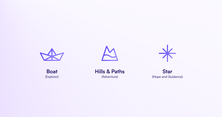
The logo embodies exploration, adventure, and guidance, all while depicting a simple paper boat inspired by origami art. Its shapes may also be interpreted as a terrain with rivers and hills evoking the association of adventure, while in its negative space there is a hidden star shape implying the ideas of guidance and hope. All those associations help position the brand in an optimistic and approachable light, while its symmetric composition help solidify ideas of timelessness, reliability and security.
Noteworthy strategic associations of the paper boat: - Simple and Accessible, low barrier of entry: Something everyone can join in and build - Playful, friendly & joyful character