Shift Eco: A Responsive Website for Every Device
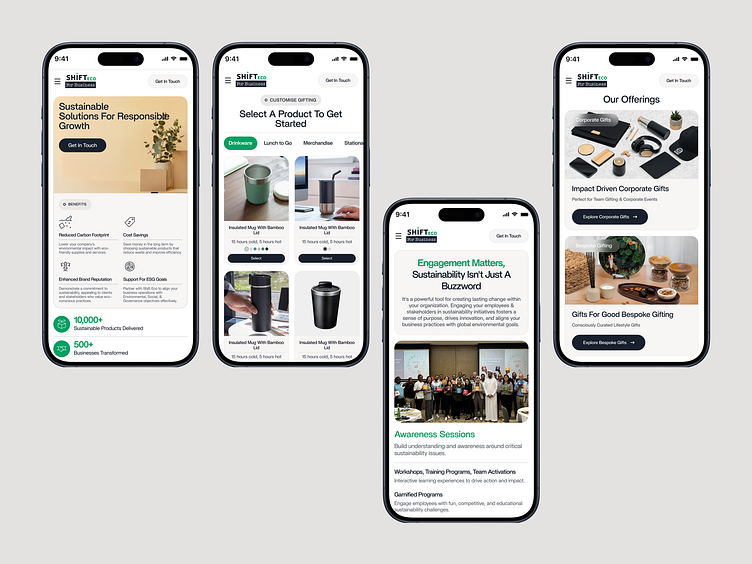
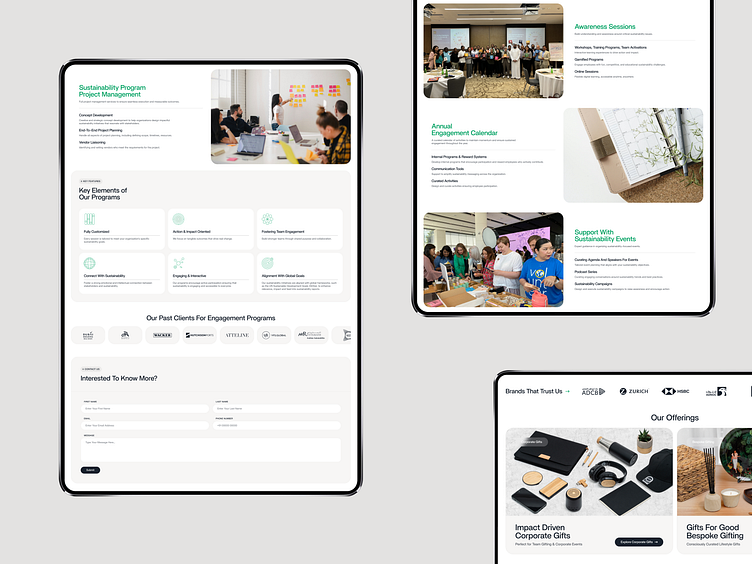
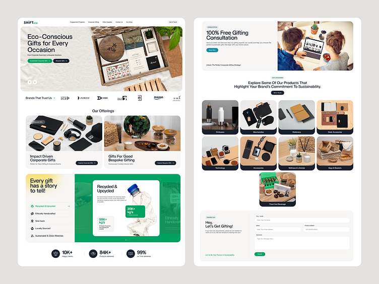
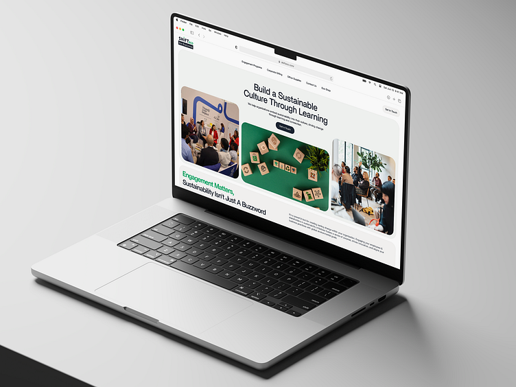
Check out Shift Eco’s responsive website, designed to adapt to every screen size. From desktop to mobile, the experience is smooth, engaging, and visually stunning. Crisp layouts, intuitive navigation, and interactive elements make exploring their eco-friendly products a delight.
This responsive design ensures users can explore their eco-friendly products and services effortlessly, whether they’re at home or on the go.
Explore the other pages → UI/UX & Product page