Seative Digital – Branding Case Study

Hello there,
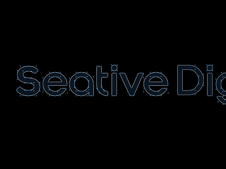
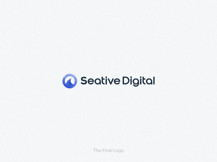
The branding of Seative Digital embodies a digital-first mindset, ensuring a strong, recognizable brand presence. Our approach focuses on versatility, balancing modern aesthetics with functional clarity. Each iteration refines core branding elements like clean typography, dynamic shapes, and a carefully curated color palette to create a visual identity that resonates across digital platforms. Designed for adaptability, our logo effortlessly integrates into diverse applications, reinforcing innovation, creativity, and technical precision. Whether for a bold website header or a subtle brand mark, Seative Digital’s logo is crafted to leave a lasting impression.
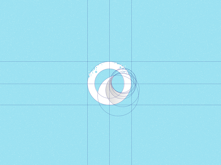
Logotype
Typography
Final Logo
Want to be the next Centicorn? 💸 Get a quick analysis and a free assessment from Seative Digital. Your information will be secure and confidential.
📮 Email: hello@seative.digital
🗓 Calendar: Book a business meeting
Let’s create something delicious together! ❤️
Follow us:
LinkedIn | Instagram | Twitter (X) | Facebook
Thank you for watching!