Bitrise™ - Logo Design For A Tech Software Growth brand
The Challenge
Bitrise™, a software development and digital growth tech brand, needed a strong identity to stand out. Their old branding didn’t clearly show their expertise or innovation. They wanted a modern logo that reflected technology and growth.
The Concept
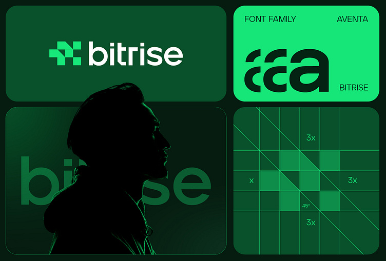
The logo combines pixels and a growth arrow, symbolizing digital progress and development. The pixels represent technology, while the arrow shows upward growth. Green was chosen to reflect innovation, trust, and success.
The Process
Research & Discovery: Studied digital growth trends to create a strong concept.
Sketching & Iteration: Explored multiple versions of the pixel-arrow idea.
Refinement: Polished the design to ensure it worked across all platforms.
Branding Extensions: Developed a full brand system, including colors, fonts, and marketing materials.
The Impact
Stronger Identity: The new branding gave Bitrise™ a fresh, professional look.
Increased Trust: Clients saw them as more credible and innovative.
Better Recognition: The unique logo helped Bitrise™ stand out in the tech industry.
Client Satisfaction
The Bitrise™ team loved the new design. One client shared, “This branding truly reflects who we are. It’s not just a logo—it’s our identity.”
Conclusion
Bitrise™’s new branding improved their market position and built trust. The pixel-arrow concept, combined with the green color, created a lasting impression that continues to drive their success.
Press "L" to show your love ❤️️
______________________________________________________________________________________________
👉 Say goodbye to ineffective logos and hello to a design that’s both memorable and recognizable!🌟
📩 Available for new projects :
Email: info@rahidrehman.me
WhatsApp: https://wa.me/8801705553455
Telegram: @rahiddesigner
💡 Follow for more update: Dribbble, Behance, Instagram, Twitter, Linkedin
© Rahid Rehman