005 daily ui: countdown
countdown — concept design
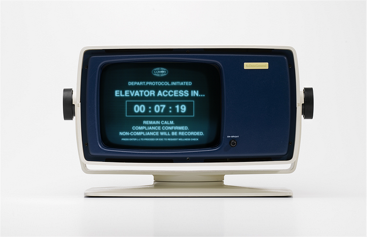
i've been slightly obsessed with apple tv+'s severance lately, so had to design a countdown screen inspired by lumon’s retro terminals. i wanted to balance retro nostalgia with the show’s controlled, corporate atmosphere — simple, functional, and just a little unsettling.
terminal: inspired by vintage ibm and ms-dos systems — a nod to 1970s tech that fits the show’s mid-century corporate aesthetic.
typography & colour: soft blue glow mimics classic crt monitors, with white digital numbers for sharp contrast. used helvetica (not the custom font from the show, but close enough).
language & tone: clear, corporate, and just a bit eerie — a subtle hint of lumon’s surveillance culture.
