Upflow Wordmark Logo Design
Introducing Upflow
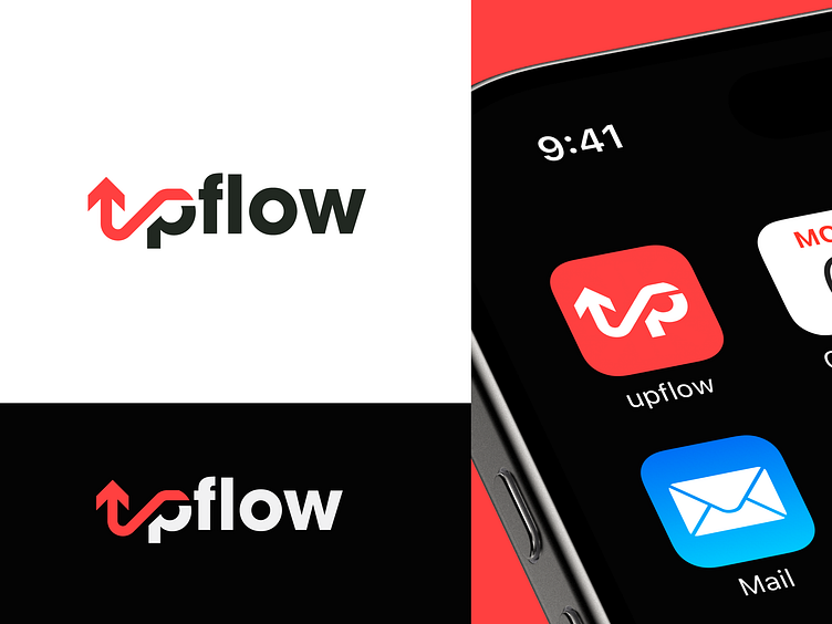
The Upflow logo represents a forward-thinking and dynamic business or product, likely to be associated with growth, progress, or efficiency. It's intended to imply upward momentum, innovation, and a modern, streamlined methodology.
The Challenge
The objective was to create a logo that represents the concept of "upflow" in a memorable manner, while still maintaining a clean and contemporary appearance.
The Concept
The stylized "up" arrow integrated into the "p" in "Upflow" is the focal point, clearly indicating upward motion and growth. The red color contrasting with the rest accentuates this key element and symbolizes energy and dynamism.
The Steps
I began by brainstorming how to symbolize "upflow" visually, with the idea of an arrow at the center. Placing the arrow into the "p" was intended to make a smooth and clever visual link to the company name. Red was selected as the color to create a high level of contrast and highlight the upwards movement. The simple, sans-serif font matches the streamlined and contemporary look of the logo.
The Solution
The final version features a trendy "up" arrow within the "p" of "Upflow," in a bold, readable font. The red arrow highlights the upward motion and progress, and the overall design appears modern and dynamic. The arrow makes it memorable and versatile for various media.