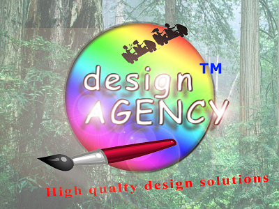
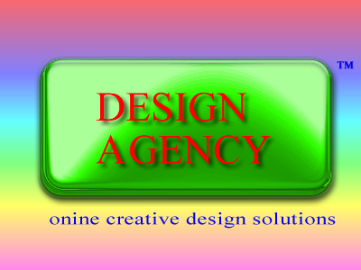
Bestest Logo 2.0
Comic Sans - Check
Times New Roman - Check
Tahoma - Check
Random Clip Arts - Check
Multiple Lens Flare - Check
Hideous Colour Scheme - Check
No White Space - Check
Unreadable - Check
Typo - Check
Drop Shadow - Check
Bevel - Check
Bad Kerning - Check
Fake TM - Check
Alignment Issues - Check
Stretched Type - Check
No Sense Of Visual Hierarchy - Check
Graphics Not Unified - Check
What else could I improve?
-----
Don't take this seriously. Saw a shot that intrigued me and was inclined to rebound lol
More by Stephen Leung View profile
Like

