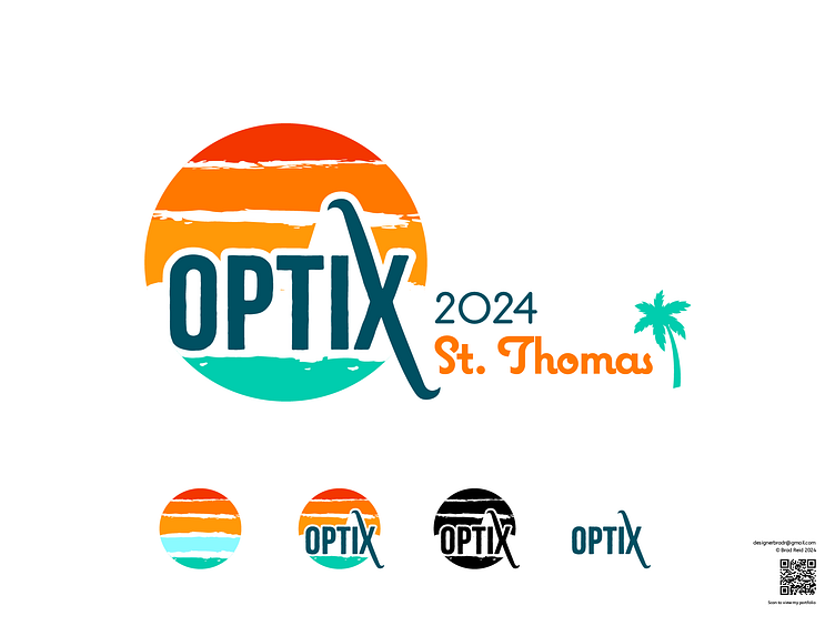
Optix event logo design
About this Logo Design
This design is NOT for sale as it was purchased by a client. If you would like something similar conceptually, please contact me!
To inject new life into a longstanding company event for elite performers, a client reached out to me to envision how we could develop a logo that could stay virtually the same every year, even if the location of the event changed from an island one year to a mountain the next.
This idea mixes many ideas derived from that brief. The human connections built at the event are conveyed through painterly strokes. It's the imperfections and character that make us unique and interesting to connect with. You'll see that conveyed centrally.
The font here is a narrow sans serif font that contemplates the idea of elongating one axis of the X. This provides a climbable zenith, speaking to achievement, and leads viewers to a footing that cradles and grounds. The entire design composition is inspired by destination art designs, where you might see a horizon within a circular element. Overall the CEO fell in love with this design and hoped to use it for many years to come.
Let's discuss how I can help!
💬 DM me at Dribbble
📥 Email me: designerbradr@gmail.com
💼 Connect with me on LinkedIn and get an in-depth look at my professional resume and recommendations
