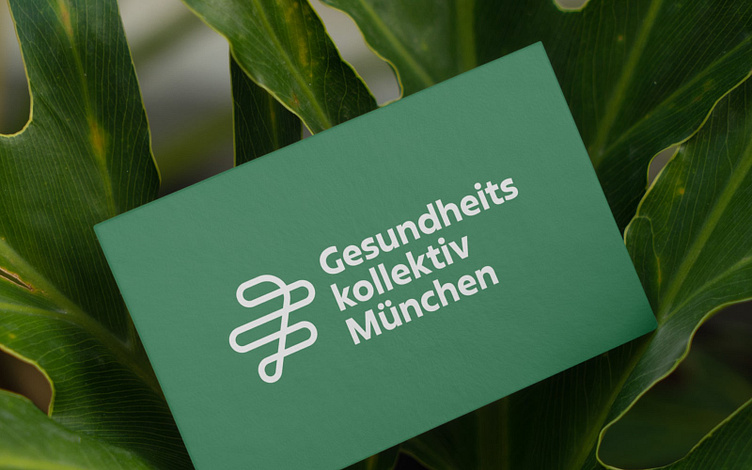
Logo Design
The Logo
The design emphasizes unity and the importance of accessible healthcare for everyone. Parallel horizontal lines symbolise the diverse social statuses within a city. The crossing line connects them all and highlights the collective's role in bridging gaps and providing inclusive healthcare. It reflects the organization's commitment to fostering a healthier, more equitable society by ensuring that all social statuses are interconnected and supported within the healthcare system.
More by Maren Schiffeler View profile
Like
