Ashgate Framers Website
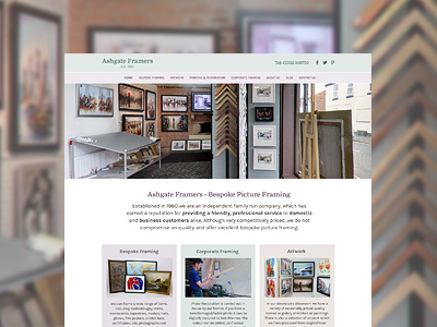
Ashgate had an old business card with green, purple and brown in light, pastel colours so I've taken these colours and ran with them. I wanted to find a nice balance between strong imagery and subtle colours. The website has photos taken from their Google Tour and uses a strong hero slideshow to give the viewer a tour around their shop.
The rest of the website is clearly laid out and takes the content from their current homepage.
More by Katherine Cory View profile
Like

