Logo Designs for The Mooring Tugboat Company
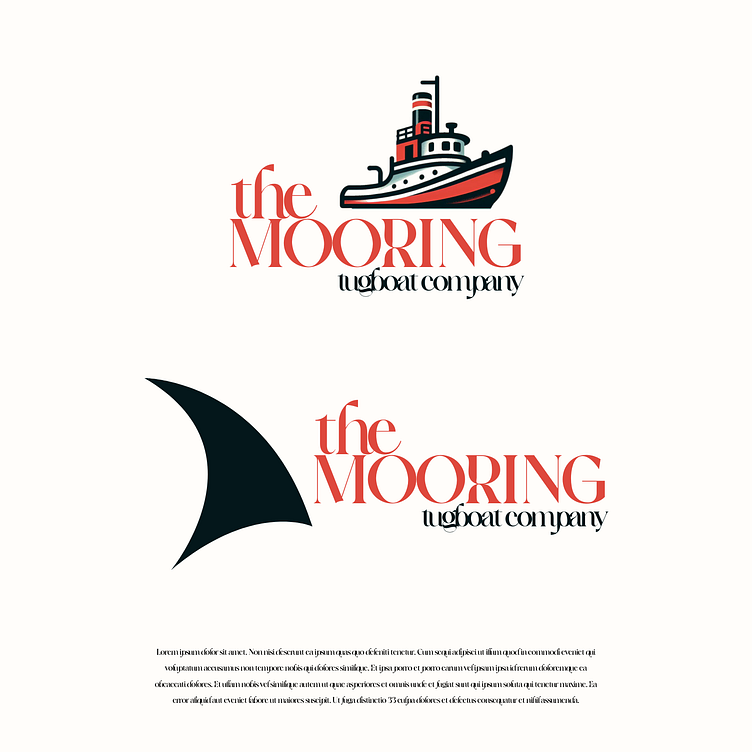
The primary logo design for The Mooring Tugboat Company features a classic tugboat in bold red, white, and black. The sturdy vessel symbolizes the company's commitment to reliability and resilience. The tugboat stands as a pillar of strength and stability, guiding ships safely to harbor. With its rustic composition and vibrant colors, this logo exudes energy and confidence, reflecting the company's reputation as a trusted leader in maritime services.
The alternate logo design for The Mooring Tugboat Company introduces a striking image of a big black fin. This sleek and powerful symbol evokes a sense of speed and agility slicing through water, representing the company's fleet of high-performance vessels. The bold silhouette of the fin commands attention, while its streamlined form hints at the company's dedication to efficiency and precision. This logo captures the essence of speed and motion, making it an ideal choice for promotional materials and merchandise.
