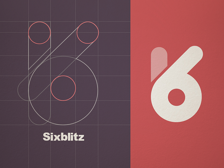
Sixblitz Logo
In creating the "Sixblitz" logo, I focused on encapsulating a sense of innovation and dynamism. The use of circles and curves in the design process helped me create a sense of motion and continuity, which is critical for the brand's image. I chose a bold red to evoke energy and passion, setting it against a muted background to ensure the logo stands out with clarity. For the texture, I added a subtle paper-like quality, giving the design depth and a tactile feel, which brings a warm and approachable quality to the digital realm. The typeface for the "Sixblitz" wordmark is clean and modern, complementing the logo's minimalist style and ensuring that it remains readable across various applications, from web to print.
More by Bipasha View profile
Like
