Car Interface design project
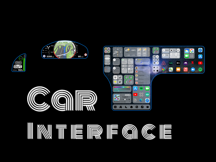
When developing the interface, the presence of a projection display on the machine was taken into account.
The main screen (in the center) is built on widgets with which the driver can control various vehicle systems with a single tap. Knowing that drivers prefer the main systems to be controlled using physical buttons, I placed the control of less important systems on the main screen.
The screen on the right (passenger screen) is visually separated from the main one by several widgets related only to the passenger. For the driver, the passenger's screen will not be visible due to the use of glass through which it is visible only when you look straight (such can be pasted on the phone screen for a long time). On the passenger's screen there is one widget that acts as a quick settings panel as on phones and the second one that stores all applications that are not placed on the main screen.
Also, in addition to the left side of the large display, the driver has an electronic dashboard and a small screen on the left.
By default, the screen contains data on speed, speed, map, route data and errors (notifications). The dashboard interface is fully configurable according to a scheme similar to the clock setting in a smart watch, here you can select a template and customize it for yourself.
By default, the small display to the left of the driver displays mileage, battery, and some car settings. This display can be adjusted according to the same mechanics as the dashboard.


