Landing Page - Daily UI 003
Here's my third submission for DailyUI.
A friend of mine recently went to Alaska and I found these great pictures up on Unsplash, so I thought what better project than a tourism site.
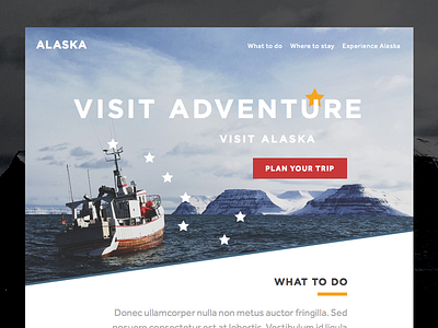
Here I felt the most important thing about designing a landing page is having a clear offering with a simple easy to understand value proposition, i.e. "Visit Adventure, Visit Alaska". Next it needs to be immediately obvious what the visitor should do next, so the CTA is bold and on red where it cannot be missed. Finally I wanted it to be obvious that there is more content further down the page, rather than resorting to a down arrow I opted for an angular crop that draws the eye down.
Fun fact: The Alaskan flag — the Plow constellation — is incorporated into the design (see the stars above the boat).
