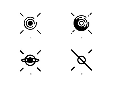
Satellite Logo
Hi. I'm working a a new logo for a new satellite that will launch in 2016. It is the invention of one of the scientist behind the canadian arm.
It will be called C L A I R E
(Because the satellite will be available to the mass and they wanted a friendly and memorable name. Plus the scientist comes from Pointe Saint-Claire)
So how does CLAIRE work?
Air pollutants absorb light of different wavelengths, creating their own fingerprint. CLAIRE finds those fingerprints using sunlight, and then measures the brightness of each of them to determine how much pollutant is present.
The tests you see here comes from these reasoning :
- the 4 bars represents the antennas of the satellite (which are position that way
A = you have some C for Claire rotating around the earth
B = same thing plus a subtile reference of fingerprints and a brighter side to express the brightness measurements
C = Trying to mix an Eye and Planet
D = Simple expression of something orbiting around the earth and some sunlights.
The typo is there just as a reference. Need more tuning.
Plus they might be some colors and/or textures, but I want to figure out the shape first as it might be use like that a lot.
There is some variations in attachments and a 3D model of the satellite.


