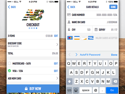
Credit Card Checkout - Daily UI 002
Here's my submission for the second DailyUI challenge, "Credit Card Checkout".
Here's made a checkout screen for a New Balance shoes app. I was thinking about under what conditions you could use a strong call to action or CTA.
When a keyboard is required, it's better to stick to the iOS HIG and place the CTA at the top right so you don't have scroll through the keyboard. If a keyboard isn't required you can use your own large bold CTA to draw attention to crucial actions.
More by Will Thomas View profile
Like
